Ranking Big Ten logos from best to worst

We've ranked all 14 Big Ten primary logos based on overall design, uniqueness, recognizability, and permanency.
These are current primary logos only. All logos were verified and provided through SportsLogos.net.
RANKING SERIES
#14 Rutgers Scarlet Knights
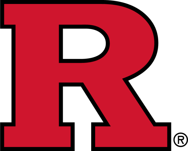
It's the Big Ten so there are a lot of block letter logos here. While some will be higher on the list because of the recognizability they have earned, Rutgers R is just an R. It has been their primary logo since they departed from this Arena Football-looking logo. The R logo also went to the helmet replacing this gem. Rutgers has staked claim to be "the birthplace of college football". If they want to be plain and classic, then just go all-in with the throwbacks.
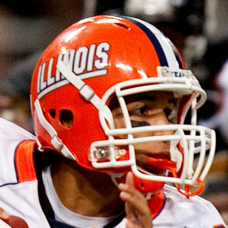
#13 Illinois Fighting Illini

I made the polarizing pick of ranking Illinois' uniforms in the top 4. While my love for blue and orange was a big factor, it can't do enough to help raise the block I with rounded insides. Illinois moved on from their block italic font that was used everywhere, including on the helmets. I don't hate the logo, it's just hard to make an I look cool.
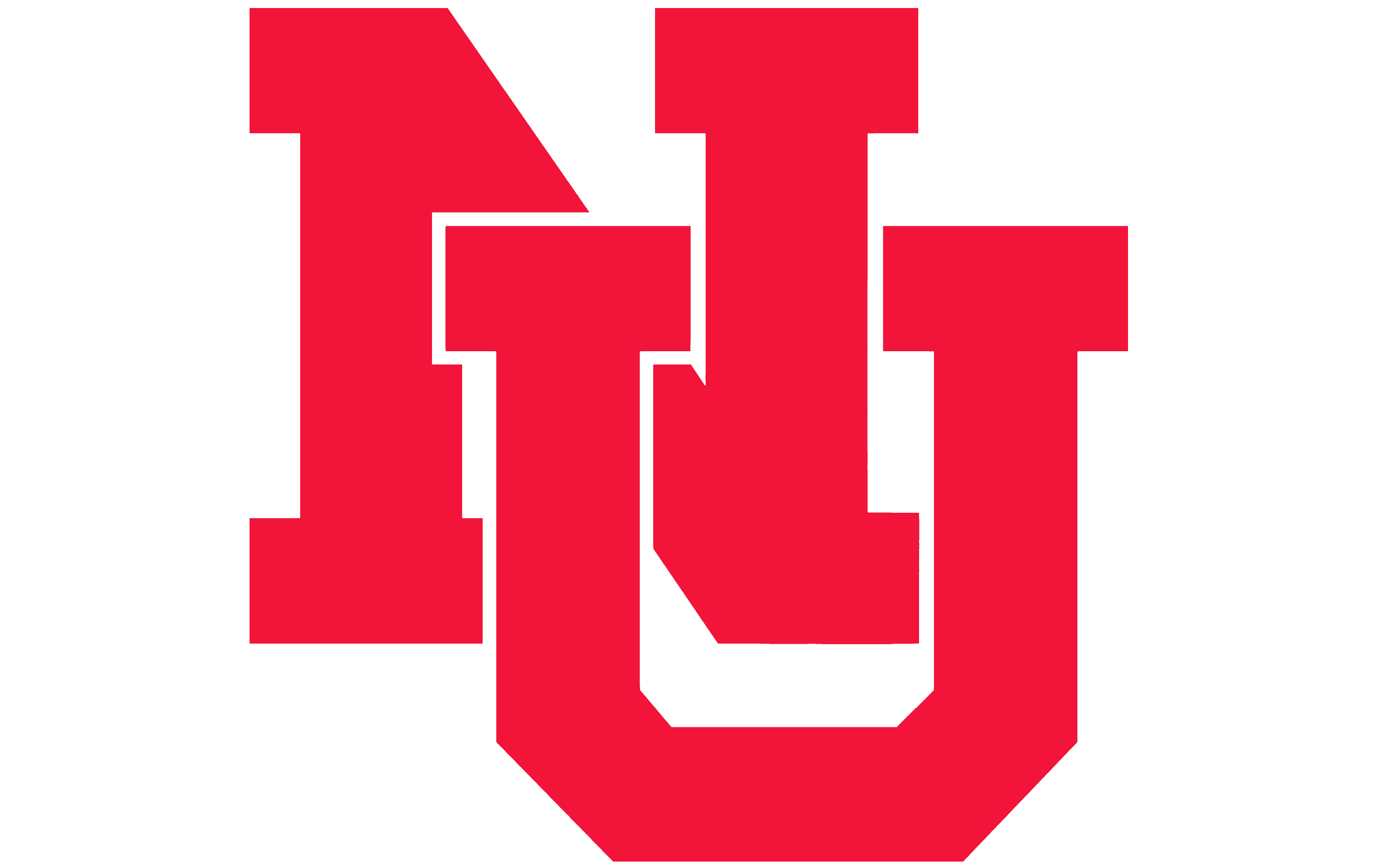
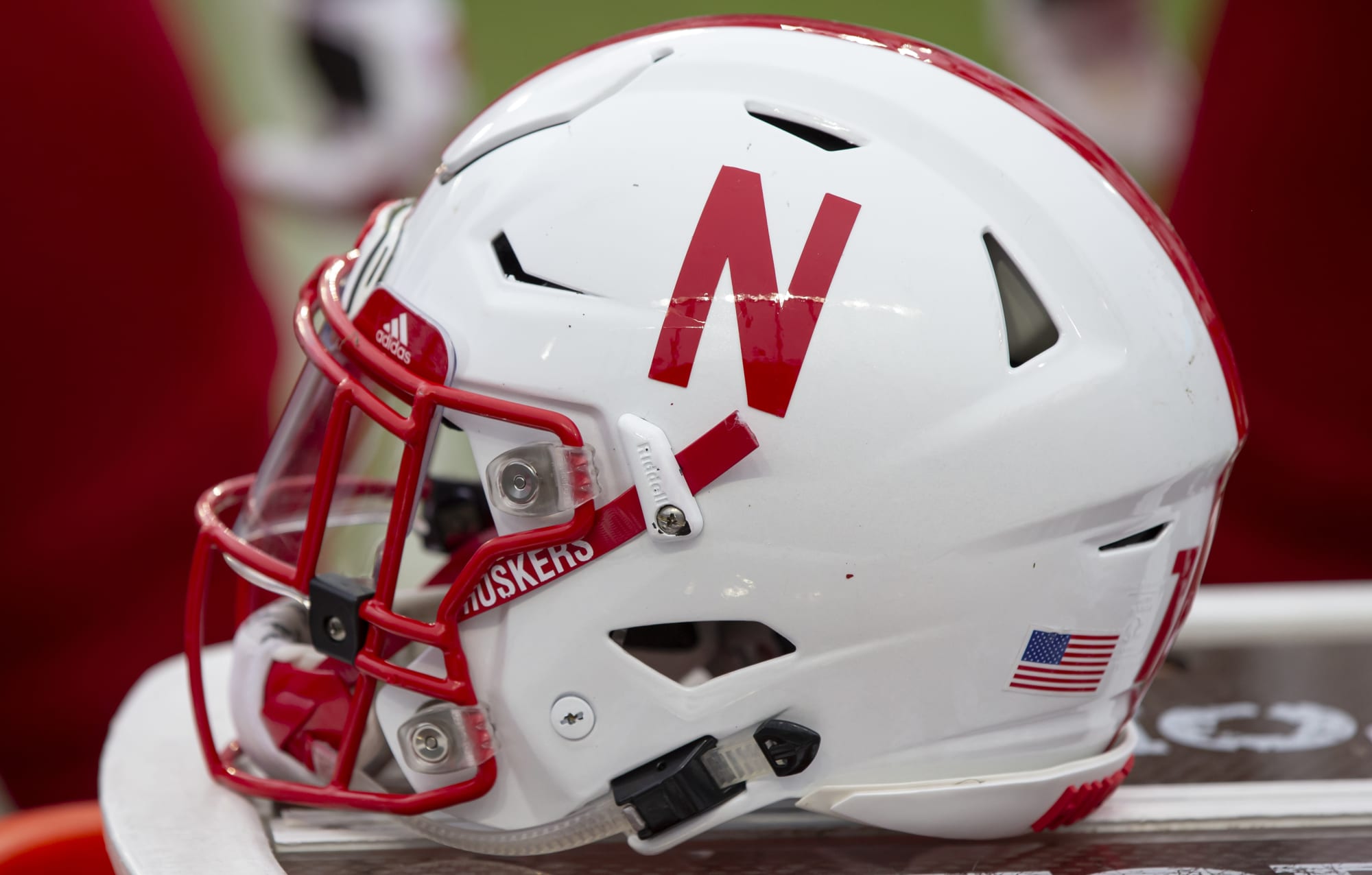
#12 Nebraska Cornhuskers
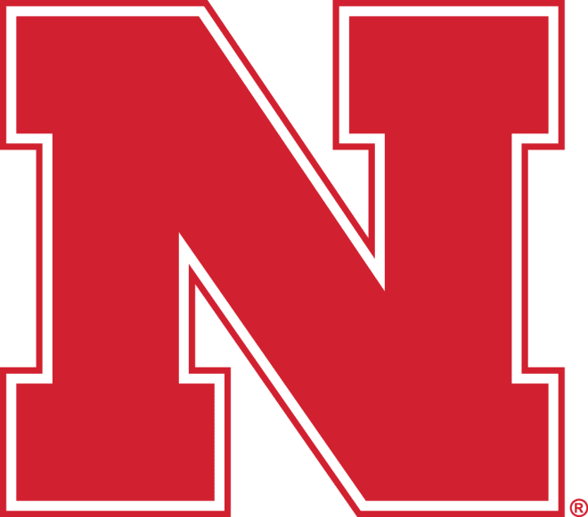
Nebraska's block N. Surprisingly, they have used this logo since 1970 when they moved on from their NU logo. This is another logo I don't dislike but just doesn't do it for me. It's very similar to many of the block logos ahead of it. When I think of Nebraska, I don't think of this logo. I think of this one, with Huskers included. Or the simplified helmet logo.
#11 Purdue Boilermakers
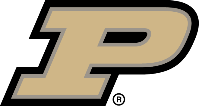
While Purdue makes the black and gold color scheme look great on their football uniforms, it just doesn't transfer to their logo. Truth is, this is the problem with gold. It requires reflection and shine, and you just can't do that with flat colors. The tan in between the black and gold makes it worse turning the gold into a brown. It is still an upgrade over this version that just used yellow for the gold. The blocky italic P is different and very recognizable as Purdue however.
#10 Maryland Terrapins
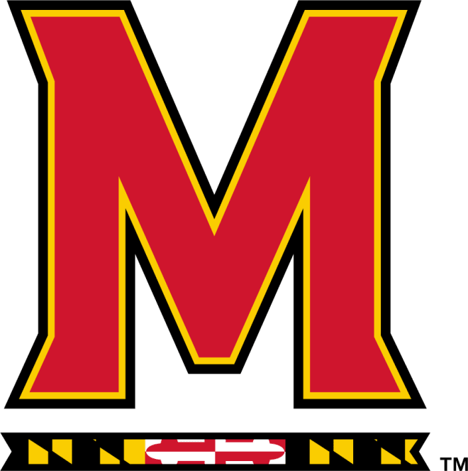
Here comes the M's! Your logo is an M and your colors are red and yellow and you don't make people think of McDonald's? Well, that's a win in my book. This is one of the newer logos on the list after Maryland used this guy for years. It's a unique M that comes from their font and subtly features the flag. Not something Maryland is normally known for.
#9 Indiana Hoosiers
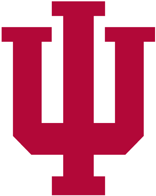
In the recognizable department, the interlocking IU is one of the more recognizable in college sports. The logo IS Indiana. This version was an alternate logo through the 90s before becoming primary when Indiana moved away from this shadow version. The extended blocks are a nice touch. There are a lot of block logos, and a lot of interlocking logos, and Indiana's is one of the best.
#8 Wisconsin Badgers
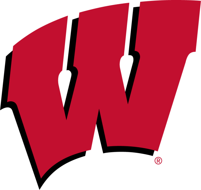
How do you make a block logo unique? Clip art style arch! Here's the thing, it works. This logo is cool and different and undoubtedly Wisconsin. Before the switch in the 90s, Wisconsin used this bizarre W with the missing block in the middle. Before that was the giant sans serif W that was featured on the front and back of their helmets.
#7 Minnesota Golden Gophers
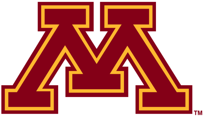
It's ugly and perfect at the same time. This has been a classic logo for Minnesota for a long time. For most of their early history, they used varying gopher logos. They also used M's similar to Michigan's. This flag from the '50s features all three. Since the 80's though this logo has been the exclusive primary. It's unique and only recognizable as Minnesota.
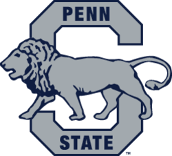
#6 Penn State Nittany Lions
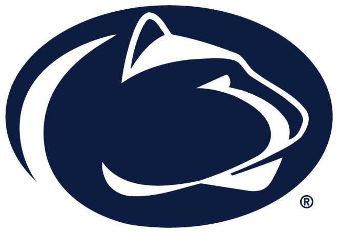
How do you make a great logo for a program known for being logoless? In the early eras, Penn State focused on State and lions, like this old drawing. They also used this block S logo, which was the font influence on their recent throwbacks. This logo has been around since the 80s and is a classic. Way ahead of its time in terms of minimalist logos and a perfect fit for a program known for its plain and traditional uniforms.
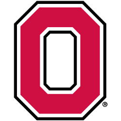
#5 Ohio State Buckeyes
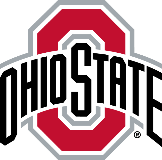
Ohio State's block O has been around a long time. They have used that version throughout the years and even more so in recent years, but the Ohio State arch over the O is the primary. For a long time, they used this inline text version. Ohio State updated the logo and briefly ruined it with this excessively thick font. After outrage from, well, everyone, they went with the solid but smaller text logo they have today. It's a classic and different take on the block letter logo. Iconic for the scarlet and gray.
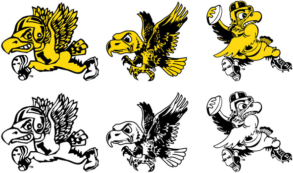
#4 Iowa Hawkeyes

Tiger hawk! One of only three primary logos in the Big Ten that doesn't feature a letter. Spurned from Hayden Fry's efforts to transform the Iowa program, the tiger hawk was something different in a time of cartoon logos. It's simple and timeless. It has been on the helmet ever since. It is synonymous with Iowa and possibly the greatest testament to a quality college logo, one of the more ripped-off logos throughout high school sports.
#3 Michigan Wolverines
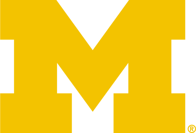
The block M is easily one of the more recognizable on this list. This version in some iterations has been used back to 1901. That's some staying power. However, the M wasn't the primary until it first showed up with a Wolverine in 1964. Throughout the 70s, 80s, and 90s Michigan used the M featuring Michigan, with a longer point. Heading into the 2000s, Michigan featured countless M designs and color schemes. The simple block M didn't become the true primary until 2012.
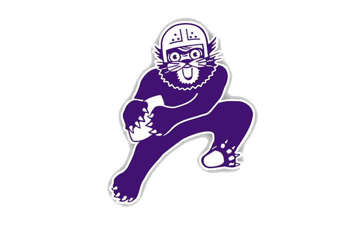
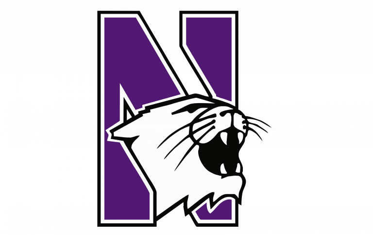
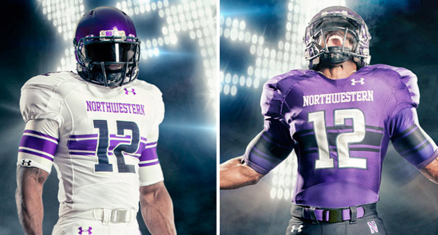
#2 Northwestern Wildcats

The best block letter logo in the Big Ten belongs to Northwestern. Their cartoon logo of the 50s was one of the worst. Their primary for a long time until 2012 was the N featuring a wildcat. The clean and simple version they now are awesome. It is unique with the reverse slashing and purple and white. The thick and thin lines work perfectly with Northwestern's embrace of the Northwestern Stripe.
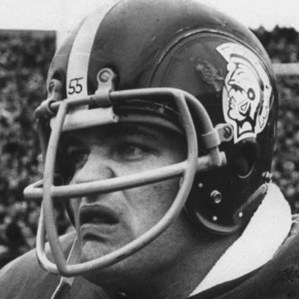
#1 Michigan State Spartans
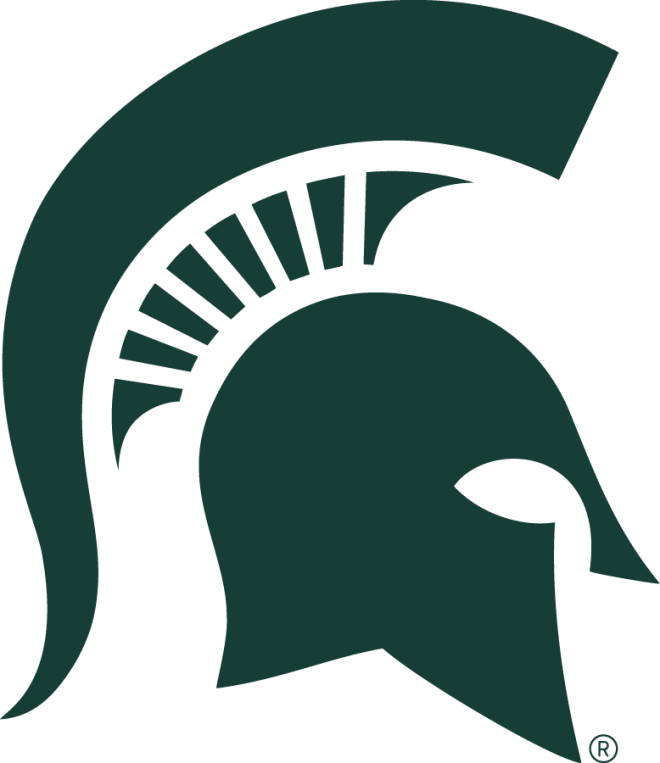
The final Big Ten logo to not feature a letter and is my best logo in the conference. This Spartan logo became primary in the 70s when MSU moved on from their cartoon logo of the 50s, Gruff. Prior to this, MSU had used a helmet logo briefly that resembled USC. Despite this awesome Spartan logo being primary, Michigan State used its block S logo throughout the end of the 20th century. The Spartan logo would appear briefly in the 90s before going back to the block S. It became permanent in 2003 and has really been key to MSU branding efforts ever since. A Nike rebrand led to this 300 inspired logo that would never see the light of day. Despite Tom Izzo's defense of the new logo, the revolt from alumni and students was enough for MSU to backtrack and keep their current Spartan logo. It was a smart decision. The lines are clean, it is unique and timeless, and it's the best logo in the Big Ten.
---
Discuss this article with our community on our premium message boards
Not a subscriber to The Maize and Blue Review? Sign up today to gain access to all the latest Michigan intel TMBR has to offer
Follow our staff on Twitter: @JoshHenschke, @BrandonJustice_, @ZachLibby, @TrevorMcCue, @DennisFithian, @BrockHeilig, @DanielDash_, @StephenToski, @Baird_CJ, @JimScarcelli
Subscribe to our podcasts: Apple Podcasts, Google Podcasts and Spotify
Check out The Maize and Blue Review's video content on YouTube!
Follow The Maize and Blue Review on social media: Facebook, Twitter and Instagram