
Last year's list caused some interesting and controversial takes. With 4 teams making subtle changes to complete overhauls, I have decided to rerank the list, including taking a look at sets that have not changed.
I've ranked all 14 Big Ten uniforms using scoring based on design, color scheme, logos, and whether they are timeless/enduring.
So let's get started with our first new uniform, a change for the worse.
#14 Indiana Hoosiers (LY 12)
With last year's last-place team getting a major upgrade, and Indiana getting a very "cheap" downgrade, the Hoosiers are now last in the Big Ten.
Indiana has made a change for 2023 and has somehow gotten worse, and that's at least partially because Adidas is using cheaper materials for its uniforms.
One of the worst crimes in uniform design, adding black just because, and Indiana does it. At least the red and white was cleaner, the black now shows up on the helmet and pant stripe, as well as the facemask.
Nothing about this says, Indiana. There are options, like putting the candy stripes on the shoulders. Rock the script helmet. That's an IU identity.
#13 Rutgers Scarlet Knights (-)
With last year's last-place team getting a major upgrade, Rutgers falls to last.
Rutgers fails to separate from the other plain red and white unis in the Big Ten. I prefer clean and traditional, and I feel someone other than Adidas could make them way better—the bizarre number font, and the super long Rutgers across the chest that stretches into weird iterations. The jersey is a mess. It is far better than this era, but that isn't saying much. I said last year, I wish they could make something with the throwback work.
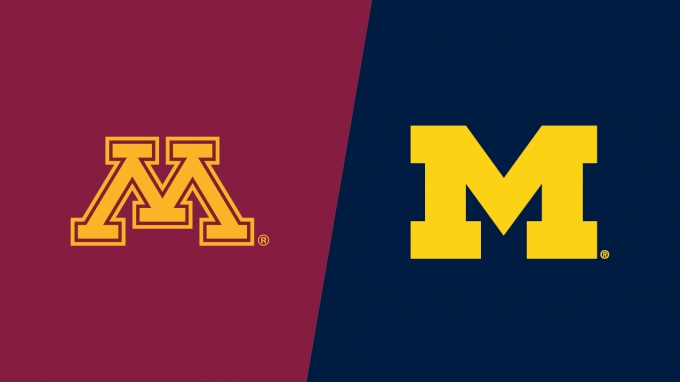
#12 Minnesota Golden Gophers (LY 11)
These aren't terrible, the conference just has really good uniforms and Minnesota has an odd color scheme. They have a unique and cool M logo in the same conference as Michigan. I don't even mind the giant gopher. I know Fleck builds a culture around it, but the paddles on the helmet with a program like Minnesota bothers me. These aren't bad, and they are close to being good. A hybrid with the current look and these maybe?
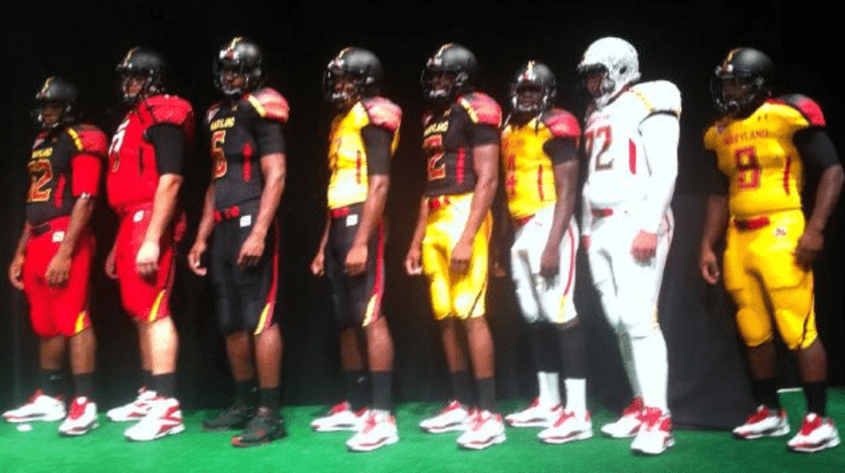
#11 Maryland Terrapins (LY 14)
Last year I called for these throwbacks and here we are. Maryland went on quite a journey from these to where we are now.
I might have been in the minority on the black helmets with the flag, but it was just too much with the designs in the jersey themselves.
After trying to be Under Armour's version of Oregon for years, they are going with this classic clean look. Script font on a helmet, are you paying attention, Indiana??
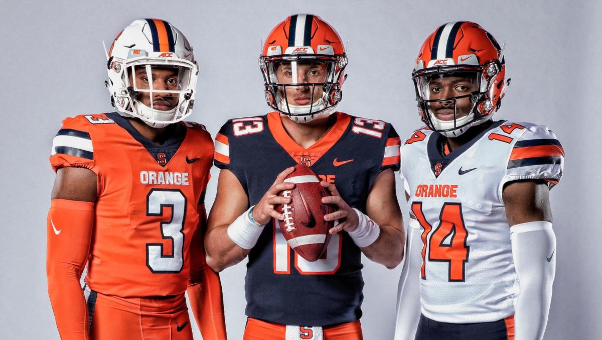
#10 Illinois Fighting Illini (LY 4)
My most controversial pick last year was how high I had Illinois. I admitted I have a bias for the navy blue and orange combination.
Now, compared to this look in the 2000's, I loved the modern take on the Dick Butkus era uniforms. When Bret Bielema arrived they started adding white outlines to this look. I knew that new uniforms were coming this year, and I thought it would just be more white trim. What we got, was Illinois just copying Syracuse. I mean, do they not know how ridiculously close these are? I prefer Syracuse actually, because the blue doesn't disappear on the road uniforms.
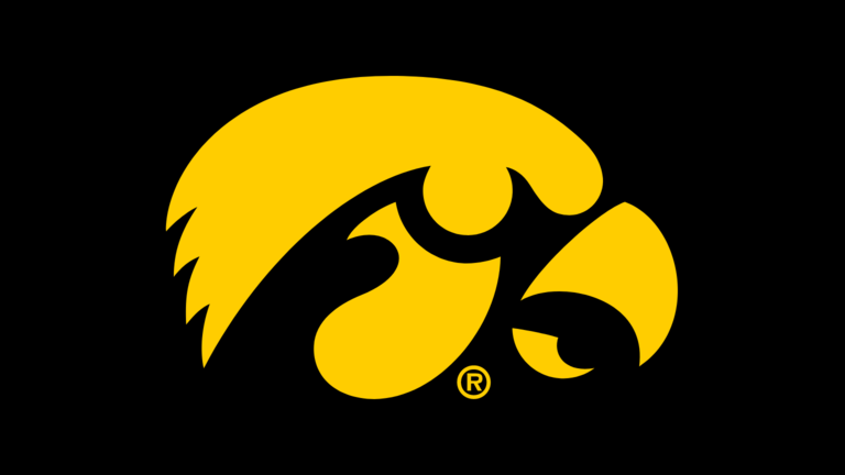
#9 Iowa Hawkeyes (LY 10)
Have discussed the fact Iowa asked the Pittsburgh Steelers if they could steal their look. So points loss for creativity, but Hayden Fry also created the awesome Tiger Hawk logo. It was also quite the improvement from this. So yes they stole the look, but it is a great look. I do wish not everything thing was the same, including the single helmet stripe contrasting the 3 tier shoulder, but it is what it is. If you're going to cop a uniform, why not go with some of the best in the NFL?
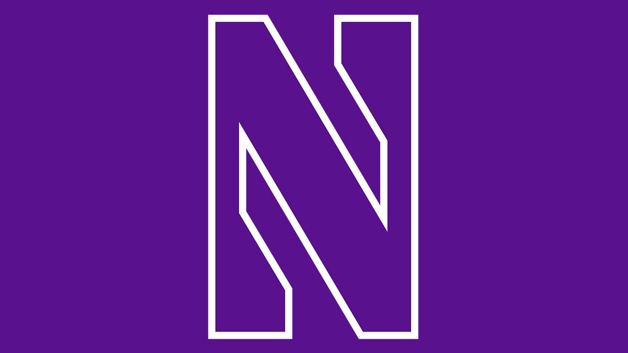
#8 Northwestern Wildcats (LY 9)
After having the "Northwestern" stripe on the front of the jersey, they are now just part of the sleeves. I may be in the minority here, but I LOVE that Northwestern took back ownership of the Northwestern stripe. Back in 1928, they were the first to use the three stripe with the heavy middle. It is everywhere in football, with some teams integrating it into every piece of their look, like the Detroit Lions.
I love the purple and white look. The N logo is awesome, and the fonts on the jersey match the theme well. The only thing keeping Northwestern further down the list is they can't get out of their own way and wear awful alternates instead of their fantastic primary sets.
#7 Nebraska Cornhuskers (LY 7)
Almost done with red and white. Nebraska has kept the same plain block N since 1970. The "Winning Tradition" patch has also been around for a long time.
I'll be honest, this is just one of those situations where timeless takes over. There is absolutely nothing special about these, but when you can keep the same uniform for 50 years and still look good, then they are great. It's plain, but it's Nebraska. That kind of ownership means something.
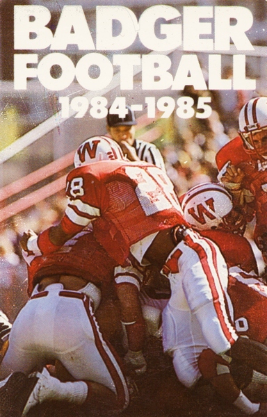
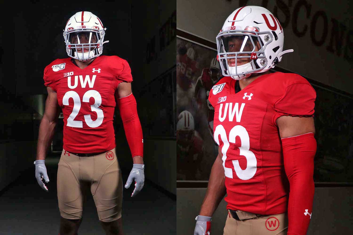
#6 Wisconsin Badgers (LY 8)
Everyone keeps moving up thanks to Illinois' fall, but I have also moved Wisconsin ahead of Nebraska
These Adidas uniforms were terrible, and Under Armour has done a good job. Wisconsin has largely kept the same look, transitioning from the old W uniforms in 1991. Their current set is clean and cohesive, which gives them the edge over Nebraska.
The helmet stripe carries over to the shoulders and pants. A nice number and nameplate font that fits their identity well. Their alternates have been, interesting, but that's more of an Under Armour problem than a Wisconsin problem.
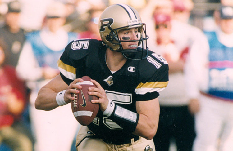
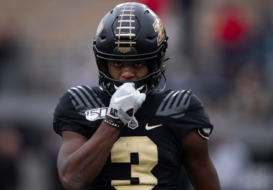
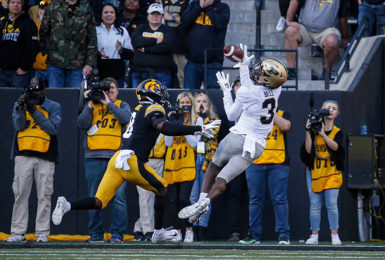
#5 Purdue Boilermakers (-)
Purdue has made a lot of subtle changes over the years, but their current uniforms are awesome. They've gone all in on black and gold, eliminating the heavy white usage during the Drew Brees era, but it appears the white may be returning to the helmet stripe. I prefer it without the white if it isn't going to be anywhere else on the uniform.
They have switched to big blocky numbers after using these odd slim italic numbers. The gold helmet pops, but the black helmet with rails is too cool. They are hardly perfect and sometimes look a lot like Colorado, but they're unique in this conference. Black and gold is a mean look when it is done right, these are done right.
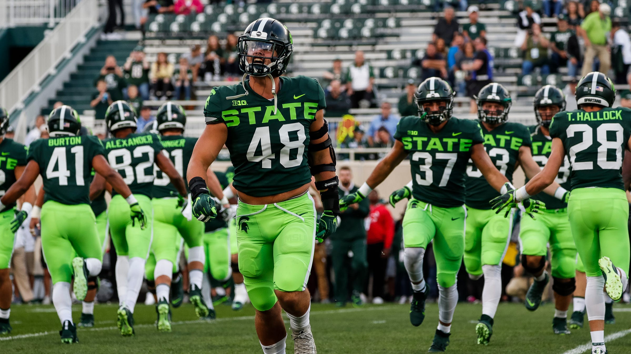
#4 Michigan State Spartans (LY 2)
Michigan State has announced subtle changes to its uniforms for the 2023 season, and I am torn.
The uniforms from the initial Nike rebrand were too busy including bulky pant stripes and a bizarre shoulder pattern. More stripped down, Sparty nails the green and white. Last season, MSU made changes week to week incorporating the throwback S and "Gruff".
It appears this new look means the neon alternate is gone for good, thankfully, but I am not sure how I feel about the Greek stripe being featured so prominently. Basketball has done the same in recent years, but I always liked the superimposed look on the shoulders compared to this new full-on stripe. And the thick helmet stripe. The "shadow" alternate is cool for a black uniform as well.
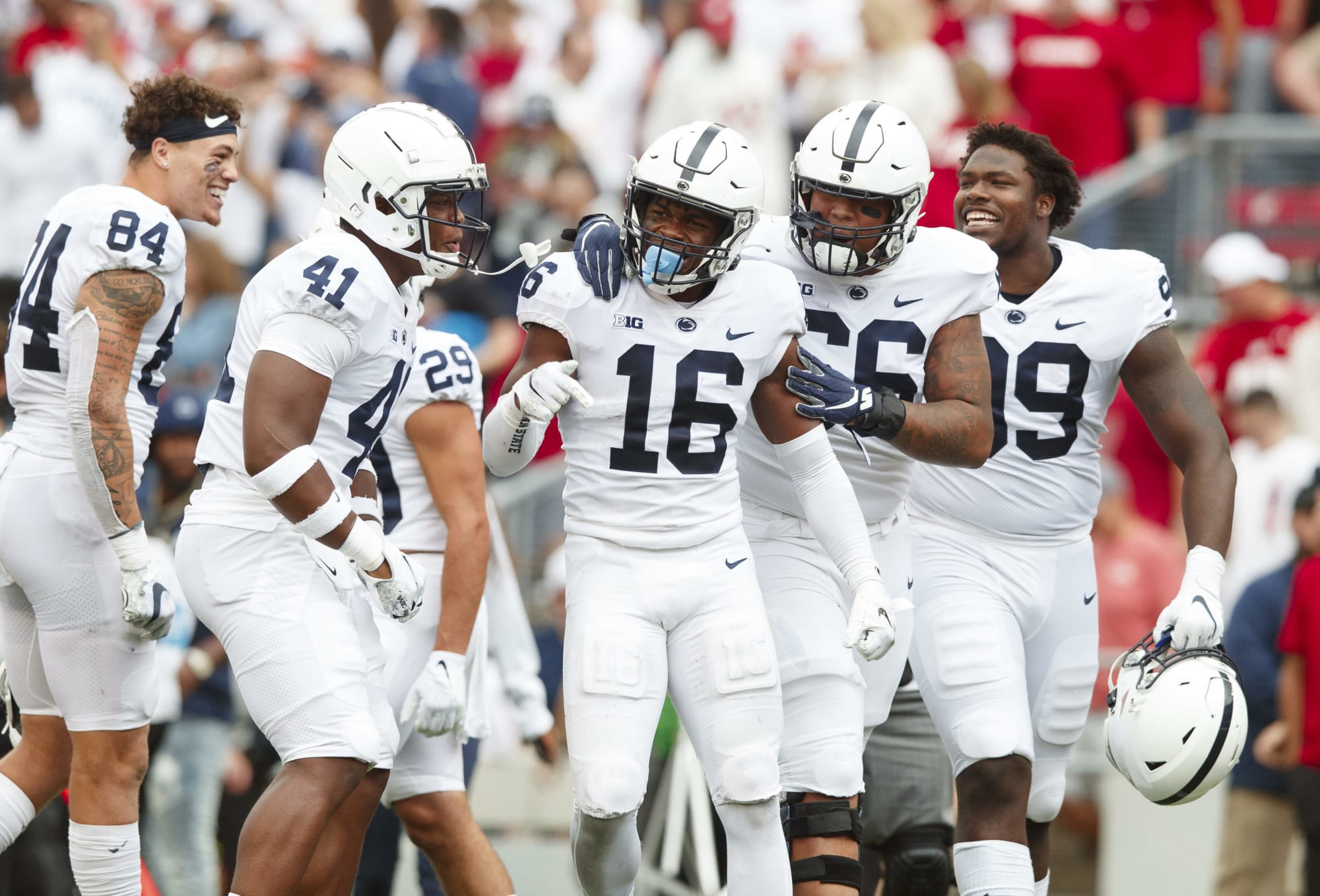
#3 Penn State Nittany Lions (LY 6)
Another controversial choice last year was having Penn State at 6. Polarizing though, some wanted them higher, some can't stand how plain they are.
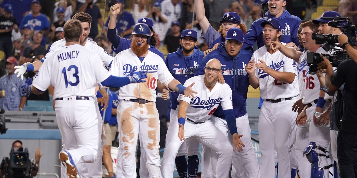
You can't get much more plain than Penn State, especially their road uniforms. I know many will call these boring, which they are, but they are also perfect. One of the best things about college football is the traditions that soak every program. Part of why this works so well is the incredibly bright white, similar to the LA Dodgers home uniforms. The contrast to the navy is so eye pleasing.
I continue to be a fan of the recent throwbacks that have specific font and helmet numbers.
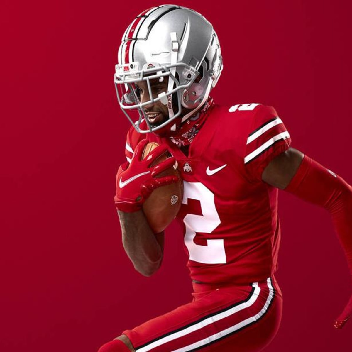
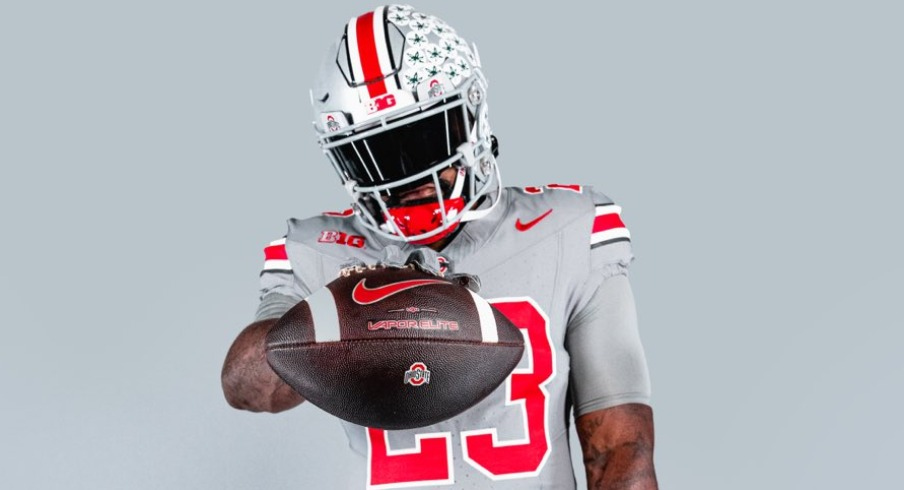
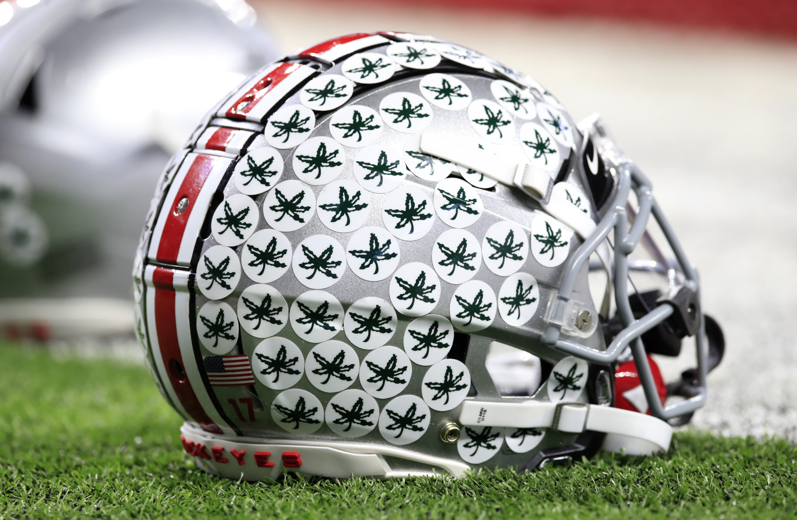
#2 Ohio State Buckeyes
I am not sure about the all-red look, the new gray alternates don't do much for me, but the primary look for Ohio State is iconic.
There aren't many iconic uniforms that can be recognized easily by non-sports fans, but Ohio State is one of them. If I say helmet stickers, you think of Ohio State's. The bright silver helmet with the bold scarlet and white/black helmet stripe is classic, as the matching pants, and the controversial Buckeyes matching shoulder stripe.
They check all the boxes and unlike other traditional uniforms, no one looks like Ohio State.
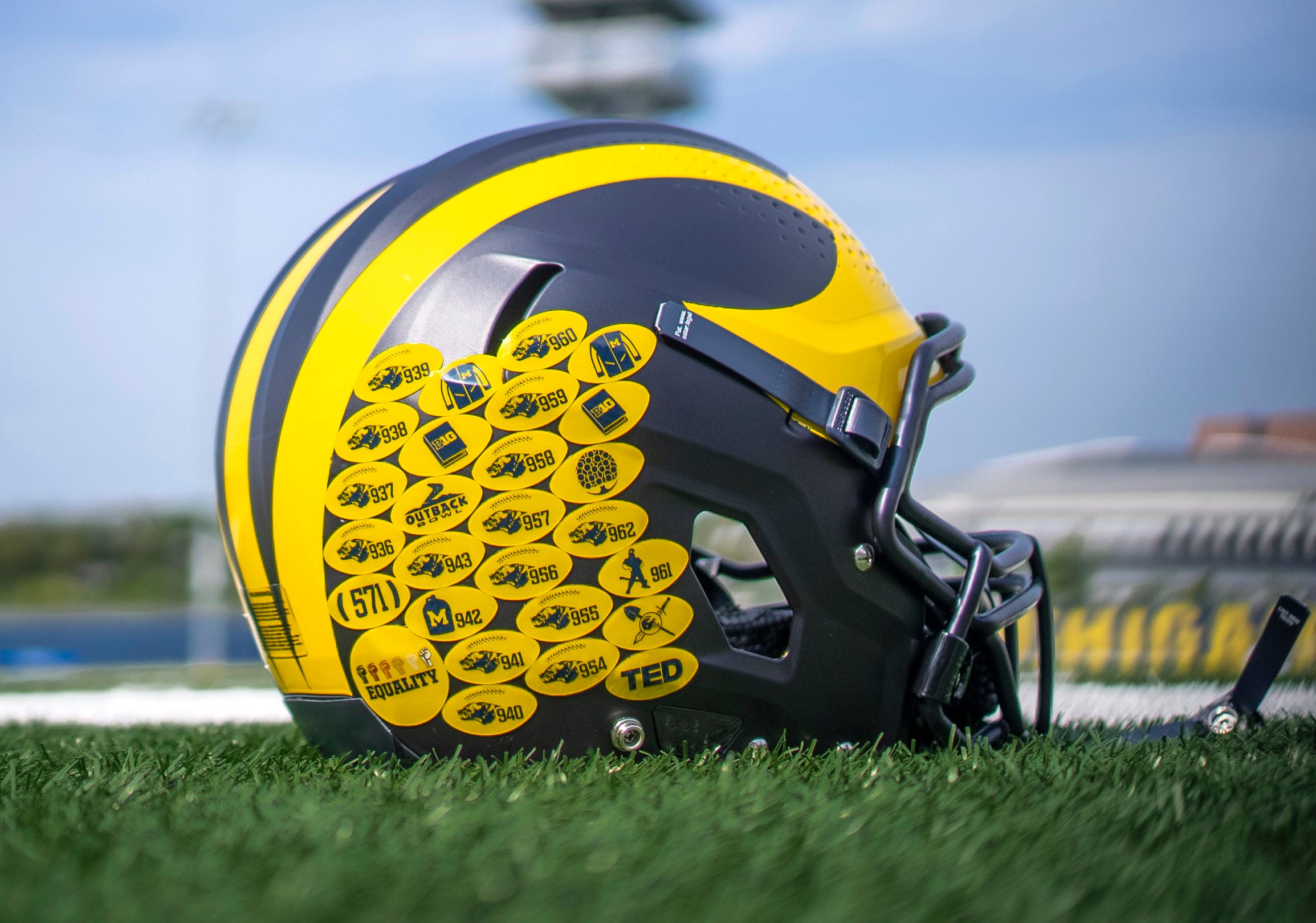
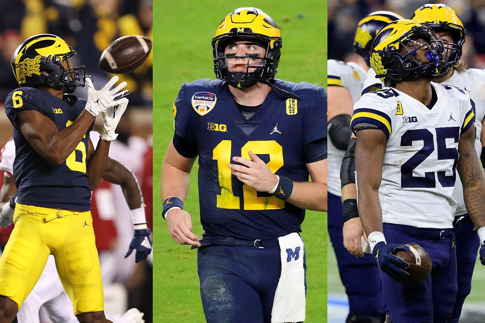
#1 Michigan Wolverines
It's maize and blue. The winged helmet. There is nothing more college football than Michigan's uniforms.
Their home uniforms have had nothing but subtle changes for decades, while the road uniforms went through some weird times. Michigan also was unable to escape the awful Adidas alternates. The move back to Nike, specifically the Jordan brand has seen Michigan tighten up and fine-tune the best uniforms in college football. A slight satin helmet that better matches the new uniform materials. A Michigan-specific font. And over the last few seasons, we have seen different pant/jersey combos to go with the classic.
Full of tradition, the Big Ten conference has the most elite uniforms in all of college football. Lists of the best uniforms in college football consistently have Michigan, Ohio State, and Penn State at the top, and this year, this list is no different.
---
Discuss this article with our community on our premium message boards
Not a subscriber to Maize & Blue Review? Sign up today to gain access to all the latest Michigan intel M&BR has to offer
Follow our staff on Twitter: @JoshHenschke, @Berry_Seth14, @TrevorMcCue, @DennisFithian, @BrockHeilig, @JimScarcelli, @lucasreimink
Subscribe to our podcasts: Apple Podcasts, Google Podcasts and Spotify
Check out Maize & Blue Review's video content on YouTube
Follow Maize & Blue Review on social media: Facebook, Twitter, TikTok, and Instagram


/cdn.vox-cdn.com/uploads/chorus_image/image/51205643/450968.0.jpg)
:format(jpeg)/cdn.vox-cdn.com/uploads/chorus_image/image/46706376/-be18032c263d15de.0.0.jpg)
/cdn.vox-cdn.com/uploads/chorus_image/image/65134531/0F9F8F38_9BEE_453B_B257_D91E9A6FFFCC.0.jpeg)
/cdn.vox-cdn.com/uploads/chorus_image/image/56712117/usa_today_10283740.0.jpg)
/cdn.vox-cdn.com/uploads/chorus_asset/file/22120506/pi_fsn_gophers_new_uniforms_2_022018.vresize.1024.576.high.81.jpg)
:format(webp):no_upscale()/cdn.vox-cdn.com/uploads/chorus_asset/file/8709325/Orange_Blue_Blue_2012.jpg)
:format(webp):no_upscale()/cdn.vox-cdn.com/uploads/chorus_asset/file/8709405/Butkus_Home.jpg)
/https:%2F%2Fspecials-images.forbesimg.com%2Fdam%2Fimageserve%2F955681794%2F0x0.jpg%3Ffit%3Dscale)
/cdn.vox-cdn.com/uploads/chorus_image/image/69809367/1230096560.0.jpg)